Wednesday, January 8, 2020


As the result of a stroke that sort of trashed three fingers on my left hand, I have had to let go of weaving. BUT, I am lucky in that I have painting to go back to. I am now experimenting with graphite, color pencil, and pastel.

I am also a member of the Milton Artists Guild.

Friday, March 3, 2017

New Venture

it's been well more than a year since my last post. I am reviving this blog because I am becoming a weaver. Same old enticements got me to try this area of invention: color, design, breadth of possibilities.

Now that I've started on this path, I can't see the end, which is exactly the kind of path I like.

I will be posting an image of every experiment I complete (and experiments are what my projects will be for a very long time!).

The images are in the order created. The first
was just to relearn what I'd forgotten when I first tried two years ago. Not surprisingly I ran into many problems, but each one was a grand learning experience.


The second project was to try a pattern on a warp and once a chunk was finished I would change the treadling to see the effects. However, I was so enamored of this pattern that I just kept going but with a different weft each time. (Will post a photo of the whole thing when I can find it!)


I already knew that my real interest would be crackle and so having ironed out the basic weaving problems, I ventured into the crackle pit. I was pleasantly surprised by the regular irregularity of this piece.


This is the second crackle attempt, and, while it has the fewest issues of anything woven so far, I like it less because it is so regular.


Tuesday, December 8, 2015

Stonehenge Quarry Found

Craig Rhos-y-felin: a Welsh bluestone megalith quarry for Stonehenge
Mike Parker Pearson,Richard Bevins,Rob Ixer,Joshua Pollard,Colin Richards,Kate Welham,Ben Chan,Kevan Edinborough,Derek Hamilton,Richard Macphail,Duncan Schlee,Jean-Luc Schwenninger,Ellen Simmons and Martin Smith (2015).   
Antiquity, Volume 89, Issue348, December 2015,                      pp 1331-1352

http://journals.cambridge.org/action/displayAbstract?aid=10057091


Thursday, September 17, 2015

Resurrection . . .

of me. Friends will know what this means. For others, it's immaterial.

I have been painting since mid-August. Since the workshop I took with Susan Abbott in August, I have been painting, reading about painting, making watercolor paints every day except one. I am still devouring information about pigments and binders.

S.O.F. Blue plus Phthalo Green
A particular search of mine has been for a turquoise that is deeply rich at full strength but still a clear turquoise when in a pale wash.  I got it last week: S.O.F. Blue with Phthalo green. Liking it so thoroughly, I went back to Earth Pigments to order more of the S.O.F. Blue only to find it discontinued. I wrote to them asking if they might still have some left, or knew of another source. They didn't, but are sending me a sample of a new blue they will be carrying though it is not up yet. I will test this as soon as comes to see if I can get a turquoise as happy as this one! I am impressed that they offered to do this for me.

Several months ago I worked a turquoise and ochreish red into this image, which I actually like very much.

Turquoise and Red

Very recently my encaustic work Backyard Bahamas was juried into The 5th International Encaustic Exhibition in Sante Fe, NM. The show will be up for the month of October (2015).
Backyard Bahamas - encaustic on 8" x 8" panel
I owe much to three friends who have helped enormously in my return to painting: Susan Abbott, Steve Weinert, Maggie Triggs. And for the constant support of my life partner Mary Jean who knows first hand the difficulties of the last few years.

Tuesday, May 14, 2013

The Hard Part of Being an Artist

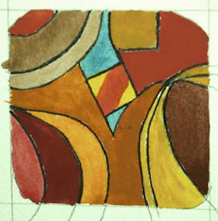
Yesterday I received an order for a button I had created about three years ago. It is my favorite button. And for a long time I did not put it on the Art Button Works web site. Instead, I placed it on the living room desk, flat, in front of a postcard that was closely related to it. Here is the Postcard:
To be sure, this is an image which needs no caption.

When I created the button, I knew immediately that it was really quite wonderful. Reader: know full well that I am not given to self-praise; I understood that this was an exceptional experience. I had to give the button a name and so I sat back and tried to think of what would be suitable for this splendid object. Finally, I had a name:
For the Queen.

I should never, ever have put it on the web site. I put a high price (for a button) on it. Yesterday it sold. I had forgotten that I had put it on the web site. The temptation to lie to the customer and say that through my inefficiency it was already sold but I had neglected to mark it so on the web site was, for one brief, dark moment, overwhelming. I did not do that. So, now, as of tomorrow, it will be gone from my world along with several other buttons.

The irony in all of this is that just a few days ago, we had decided to stop selling buttons online. It was way too much work and we were no longer making buttons. The site would have been disabled for online purchasing. (The buttons are still on sale in a local gallery, Grand Isle Artworks.)

I am experiencing a real sense of loss. It is even greater than when I sold a painting I was very fond of. The painting, though, had been in a gallery for several months. It was not part of my daily life as this button was. It even provided a taking off point for a sketch I did when I first tried working with egg tempera.

I actually have a history with Queen Elizabeth II. When I was nine and she was not yet Queen, I stood about 10 feet from the back of the train where she and Philip were standing and sang "The Maple Leaf Forever", a popular and patriotic Canadian song. I have never forgotten that experience. And, from that moment on I became a Royalist and an Anglophile.

Looking back over the years I realize now that Elizabeth was a woman respected and known to all the world. In the the early fifties and for many many years after that, this was a rare thing. Little girls did not have very many women to look up to which were in the public vision. Queen Elizabeth II has been in just such a role ever since I saw her. But my association went well beyond the person of the Queen. I hold an Honors Masters Degree in English Literature and the infamous A.B.D. in British Literature. I have a rather large and beautiful (though not valuable) collection of British stamps.

In addition to Her Majesty the Queen, the idea that women could do other things besides keep house, nurse, teach, cook, and look beautiful (all but the last are fine choices indeed but none of them appealed to me as a child) was created and maintained by the following:

Virginia Woolf
Dinah Shore
Judy Garland
Dame Edith Sitwell
Emily Bronte
Edith Piaf
Rachel Carson
Susan Hayward
Tessie O'Shea
Ava Gardner
Bette Davis
Amelia Earhart
Carol Burnett
Beverly Garland
Julie Andrews
Rosalind Russell
Katherine Hepburn
Mae West
Vesta Tilley
Colette

There are others of course, but the list above (in no particular order) delineates those I knew about before I was 21.

Tuesday, April 9, 2013

An Encaustic Art Studio for the Starving Artist

Just published on amazon.com.

An Encaustic Art Studio for the Starving Artist

The idea for this book came from my own experience in setting up an encaustic studio on a very tight budget. Not able to afford even the least expensive "studio essentials" kit ($300-$360), I spent hours reading about encaustic art and researching tools and materials until I was able to put together a really good working studio for myself.

A few weeks after this was up and running, I began to think about the six months I had delayed doing it because I thought it would be too expensive. If there had been a book like this, I wouldn't have wasted that six months.

It is not a book about techniques: there are a number of those out there. This is about the nitty-gritty of hardware, pigments, panels, grounds, and sources. The dollar amounts are included and compared. Sources are compared as well.


In short, for less money than the cost of the cheapest kit, this book (also inexpensive!) will enable the reader to set up an encaustic studio comparable to the most expensive kit  AND with more colors and more of them.

Sunday, April 7, 2013

Absence Means the Heart is Elsewhere

Been a while since the last post. BUT, there are reasons:
  • My involvement with encaustic work has been intense. 
  • Much to learn and explore.  
  • Serious illness in the family which, at the moment, is experiencing a reprieve. 
  • Nearing publication of a Kindle book for those who want to do encaustics, but can't afford it.
  • Volunteer work on design and production of a juried Exhibition in Print for the International Encaustic Artists
  •  Teaching Web Design and Development at the Community College of Vermont.
  • Preparing for my solo photography show in White River May 17th - July 17th. 

ANNOUNCEMENT: "New" blog for artists to follow:
Susan Abbott, Vermont painter, traveller, and painting instructor has initiated her Saturday Posts. The first issue is out and talks about Watercolor Palettes. If you are a painter you really need to lock onto this one. Abbott's knowledge of painting (oils and watercolors) is broad and deep. Take advantage of it.

Susan Abbot: A Painter's Year

Two New Encaustics

Dark Fiber
Against the Grain

For proper viewing: http://www.clairdunn.com/painting.htm

For now, that's all folks  . . .

Thursday, February 28, 2013

Sketch into Encaustic

Last week I sketched out a composition (second post below this one) and this week I moved it to wax. I learned a lot in this process, but it was the last thing I did that gave me pause. Because I had no Prussian blue pigment, I painted that section of the panel first with egg tempera and worked with wax on the rest of the piece.
image of encaustic composition on wood panel
Out of the Night - 8" x 8" on wood panel
Well, the Prussian blue pigment arrived and I only had time to mix it with some medium and get it on in its proper place. That meant just getting it on there without any time to scrape.

And this morning the pause arrived. Parts of the rest of the composition are not completely scraped yet, but scraped enough to show up the contrast with the roughness of the Prussian blue.

I laid on the blue with no thought to brush marks as I would be scraping. Well,  now I look at it and I find the roughness against the smooth appealing. I only wish I had planned the brush strokes.

And this is what fascinates me about encaustic. So many facets and possibilities lie within this medium that in the learning, doors keep opening and opening and opening. Reminds me of diving down into the Mandelbrot set--goes on forever.

I had planned to scrape this today, but now I honestly don't know what to do.

Sunday, February 24, 2013

Encaustic Monotypes for Starving Artists

A week or so ago I watched a short video by Paula Roland and decided I wanted to investigate creating encaustic monotypes. Not being able to afford a hotbox, nor an anodized aluminum plate, I thought--well, that's out. Until this morning.

In spending my Christmas money for things encaustic, I of course bought a pancake griddle. Non-cook that I am, I assumed they only varied in size. Not so. My lovely new palette had a surface criss-crossed with a recessed diamond pattern. Worked fine, except when I came to clean it. After a few weeks and rolls of paper towels, I decided I would put a piece of glass on it. And, that did it. Nice smooth, cleanable palette.

This morning I woke up realizing I had a hot box.  I did a bit more reading and discovered a wonderful Montreal artist, Alexandre Masimo who very kindly wrote a most helpful post about encaustic monotyping. That post and his work set me to work immediately.


I drew two rectangles (B in the image above) on a piece of ordinary printer paper. The outer one for the size of the torn paper I would use. The inner one (in red), the size the composed image would be. I slipped this under the glass (A is pointing to the glass which is invisible in this image.). You want that outer rectangle matched to the overall size of your paper so that when you want to layer pulls, you can place your paper in the same place each time in relation to the print area. (Before I started anything I checked to make sure the griddle was level--this is important as your pools of wax on the palette will run if the surface is not level.)

What you see on the griddle-glass hotbox is the remnant of wax after the print on the right was pulled. This one was done on a scrap of paper left over from my intaglio days. Those were so long ago I no longer remember the name of the paper, but is it some form of mulberry or rice paper, though not terribly thin. I used a hard acrylic roller with a sheet of freezer paper (shiny side down) between my print paper and the roller to keep the wax from bleeding through onto the roller.

On the right is the very first print I pulled just to see if all this would work. I had no blue wax sticks so into a bit of melted beeswax on the palette, I added some phthalo blue and titanium white pigment. Not fussy at this point as this is a test.

Alexandre taught me that because "normal" encaustic work occurs on a firm surface, damar resin is added to the beeswax to make the wax stiffer, but any stiffness is not good on flexible paper. All commercially produced encaustic colors are prepared with some amount of damar resin. I'm fine with that because I make my own medium and colors anyway. I have a few Enkaustikos sticks just to play with, but far more jars of pigment powders.
On the left is the second test print I did. I will be exploring ways to mix control with serendipity in this process. And, of course, exploring the latitude that multiple pulls will afford. It will also be interesting to see if I can make a straight edge with this process.

Even though I am deeply immersed in regular encaustic work right now, I wanted to give folks who want to experiment with encuastic monotypes a way to do that without selling your firstborn. Obviously with this setup your work is constrained by the griddle size. Especially if you only have one griddle. Ideally two griddles would solve that problem--one for the "poor-man's hot box" and one for a palette. You could easily get a 9" x 12" print then. But, everything you can do with a hot box, you can do with this setup.