

Sunday, September 30, 2012
Found Art
The images below are the two sides of a heavy piece of metal about 2 by 3 inches that I found on the tarmac outside a St. Albans restaurant. (Smoking does have advantages.)
 Sometimes you get really lucky and see something like this. Its jewel-like qualities are obvious, but to have a "hard copy" of oil on puddle is quite remarkable. I didn't do anything to it except wash off the dirt, take the shots, and hang it on my bulletin board.


Friday, September 21, 2012
On the edge and on edge
Since my last post (which is an important one for "my teacher" to see), I've been experiencing serious unrest and upheaval about my involvement with color and with painting.
The pairing of the two images below is indicative of the shift which seems to be pushing me out of watercolor and into some other medium. I can hardly believe I just wrote that sentence. I think I'm realizing that the color that I love is the color I see on the watercolor palette, not on the paper.
The making of the 400 squares of saturated color offered a drumbeat of working with pure colors. The photograph of the squares in the sunlight threw some kind of a switch in my brain.
Here are the images which hold the key to my future work with colors.
The image on the left was made decades ago when I was wholly enraptured by intaglio. I was at the time trapped in a school which only offered a future in lithography, a medium that had absolutely no appeal for me. (It was at this point that I went on to graduate school in literature.)
So, here am I, almost 40 years on from that red, looking for my medium, a medium that will give me the color that I want.
The pairing of the two images below is indicative of the shift which seems to be pushing me out of watercolor and into some other medium. I can hardly believe I just wrote that sentence. I think I'm realizing that the color that I love is the color I see on the watercolor palette, not on the paper.
The making of the 400 squares of saturated color offered a drumbeat of working with pure colors. The photograph of the squares in the sunlight threw some kind of a switch in my brain.
Here are the images which hold the key to my future work with colors.
 | |||
| Left: two-color etching. Right: watercolor - backyard reduced to shapes |
Thursday, September 6, 2012
From Sketch to Painting
Working with the sketch I posted here I translated it into watercolor.

Palette: Permanent Rose, Transparent Yellow, Cobalt Turquoise
I then went back to my "assignment" and translated this to pure flat shapes.

Palette: Permanent Alizarin, Cadmium Lemon, Cobalt Turquoise
The first one is done on the same rough WC paper I've been using right along, and also with the same stiff brush. The second on is on Cold Press WC paper which, while not smooth, is considerably smoother. I also used a flat WC brush which is much softer and more flexible.I think I'm quite interested in the second one. But looking time will have to pass for me to know what comes next. I know though, that I will try another triad with the same shapes. But where to move beyond this, I don't know yet.
I broke down and ordered a block of Hot Pressed WC paper. One of those things which artists have to live with: I can't afford it, but I have to have it.
Tuesday, September 4, 2012
First Sketch
Given an assignment to "look at the shadow shapes and negative shapes . . . base a painting on the empty space between the 'stuff' . . . crop down to a few shapes:"


I've ignored most of that for now because I am still trying to deal with a previous assignment of sketching. For some reason I seem to be deathly afraid of sketching. I avoid it for days and weeks while the idea of it lurks in my mind, then today suddenly, I left the computer grabbed the sketchbook and lunged to the table on the patio. The image below is shot from the patio table after I made the sketch:

Unfortunately, my courage to sketch arose on a thoroughly grey day. So there are no shadows in the photograph. However, the sun broke through briefly as I was sketching so I had some idea of light.
Below is the sketch I made. It is the first real one I've done. (I got a very nice roof line in Stowe last week, but it was in pencil, and I haven't yet made it look good in ink.)

In a slight nod to the assignment above, I cropped a section which I think can stand by itself.

And then one more, which also works by itself.

I'm fixated on my rather uninteresting backyard I think because, since the move, I've lost the yard I loved my whole life and am trying to elevate this feeble substitute to something substantial. So, I continue to look at it.
Monday, September 3, 2012
Palette Squared II
A few weeks ago I posted an image of the start of my palette chart.
I finished it this week--all 400 squares. When it was done I saw it as a piece of art in itself--more than an exercise. I took it out in the sunlight to photograph and realized it could stand alone (beyond a technical photograph of the squares themselves).

Even though my camera takes a huge image, I like the smallness here which makes the colors on the paper seem to blur and the whole more of an organic piece suited to a natural environment.
And, below, is the workaday image of the thing itself.

In making this, my whole focus, of course, was on color. Some colors got me itching to see them side by side or superimposed one on the other. And this of course led me to thinking about color field painting. Something I've not thought about in relation to my own work. I may have some thinking to do here.
Wednesday, August 15, 2012
A tentative step in the right direction

Backyard I, 4" x 6", watercolor on paper
Something about working on the squares and looking at Dove again just pushed me to do this. This is the second attempt--too much was not right with the first. This is better, but after doing this I realized I was not happy with the brush I was using. So I spent some time trying out brushes. There will be another version, but for now I needed to get something up that pushes me in the right direction. Which this does.I don't yet know how to get full intensity watercolor on the paper without it being mottled; that's why I think it's a brush problem. When I get rid of the mottling, I think I'll be happy.
The palette for this was Cobalt Turquoise, Permanent Alizarin Crimson, and Cadmium Lemon. There is a tiny bit of Prussian Blue in the deep shadows.
Tuesday, August 14, 2012
Dove, Marin, and Hopper
I decided to post about well-known artists that make me sit still and look. Three of them are American.
 Arthur Dove: Sunrise, 1937
 Arthur Dove: Untitled, 1942
 Edward Hopper: New York Movie, 1939
 Edward Hopper: Rooms by the Sea, 1951
 John Marin, Big Wood Island, 1914


How I found out about him is detailed in this earlier post.
Many years ago I saw Hopper's Nighthawks, and like the rest of the world, was stunned and fascinated by it. Since moving back into art I have educated that fascination and find his work mesmerizing.


And finally, John Marin--again revisited in depth where I discovered his landscapes as opposed to his bridgescapes and cityscapes.
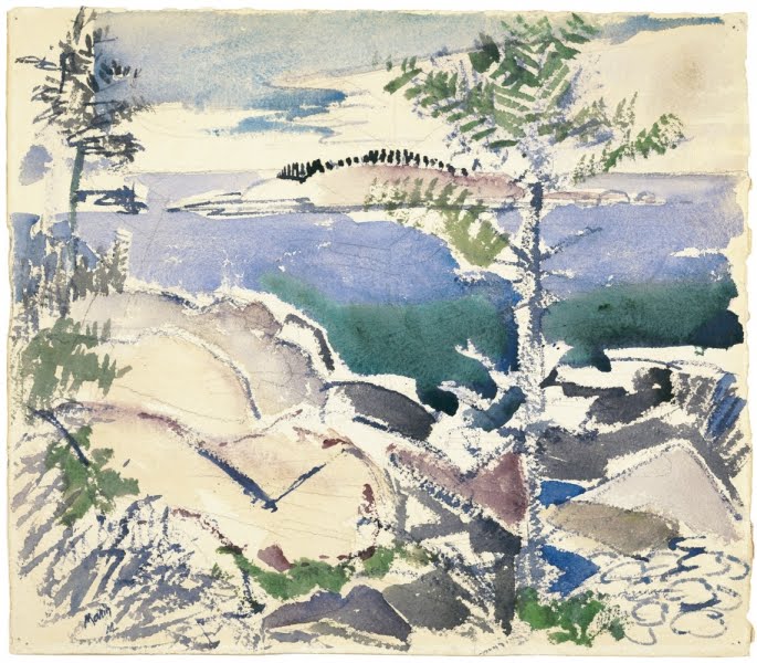
With the addition of Cezanne's landscapes and most all of the Canadian Group of Seven, these are images which swirl in whatever part of my brain works with visual things. As much as I still love Nighthawks, I think, as an artist, I am more fascinated by Hopper's Rooms by the Sea: the shape of the light outlined by the shadows is riveting, that shape made even more powerful by what seems a simulacrum on the wall of the next room.
Sunday, August 5, 2012
Merging of Blogs
In the interest of "getting it together" I have merged three of my other blogs into this one. If you were one of the few followers of
Vermont Directions (my Art of Action blog)
Vermilion Hue (my painting blog)
Clair Dunn PHOTOGRAPHY (my, duh, photography blog)
Their contents have all been moved to White River (you are here!). I am posting this because I don't know if Google transfers the followers along with the posts. My artist's web site however remains the same at:
clairdunn.com
Vermont Directions (my Art of Action blog)
Vermilion Hue (my painting blog)
Clair Dunn PHOTOGRAPHY (my, duh, photography blog)
Their contents have all been moved to White River (you are here!). I am posting this because I don't know if Google transfers the followers along with the posts. My artist's web site however remains the same at:
clairdunn.com
Underground and Surreal
Two stunning images appeared today on the New York Times site. Both are by Richard Barnes (for the New York Times).


Both are beyond words.
Subscribe to:
Posts (Atom)