Thursday, February 28, 2013

Sketch into Encaustic

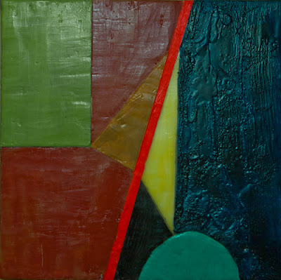
Last week I sketched out a composition (second post below this one) and this week I moved it to wax. I learned a lot in this process, but it was the last thing I did that gave me pause. Because I had no Prussian blue pigment, I painted that section of the panel first with egg tempera and worked with wax on the rest of the piece.
image of encaustic composition on wood panel
Out of the Night - 8" x 8" on wood panel
Well, the Prussian blue pigment arrived and I only had time to mix it with some medium and get it on in its proper place. That meant just getting it on there without any time to scrape.

And this morning the pause arrived. Parts of the rest of the composition are not completely scraped yet, but scraped enough to show up the contrast with the roughness of the Prussian blue.

I laid on the blue with no thought to brush marks as I would be scraping. Well,  now I look at it and I find the roughness against the smooth appealing. I only wish I had planned the brush strokes.

And this is what fascinates me about encaustic. So many facets and possibilities lie within this medium that in the learning, doors keep opening and opening and opening. Reminds me of diving down into the Mandelbrot set--goes on forever.

I had planned to scrape this today, but now I honestly don't know what to do.

Sunday, February 24, 2013

Encaustic Monotypes for Starving Artists

A week or so ago I watched a short video by Paula Roland and decided I wanted to investigate creating encaustic monotypes. Not being able to afford a hotbox, nor an anodized aluminum plate, I thought--well, that's out. Until this morning.

In spending my Christmas money for things encaustic, I of course bought a pancake griddle. Non-cook that I am, I assumed they only varied in size. Not so. My lovely new palette had a surface criss-crossed with a recessed diamond pattern. Worked fine, except when I came to clean it. After a few weeks and rolls of paper towels, I decided I would put a piece of glass on it. And, that did it. Nice smooth, cleanable palette.

This morning I woke up realizing I had a hot box.  I did a bit more reading and discovered a wonderful Montreal artist, Alexandre Masimo who very kindly wrote a most helpful post about encaustic monotyping. That post and his work set me to work immediately.


I drew two rectangles (B in the image above) on a piece of ordinary printer paper. The outer one for the size of the torn paper I would use. The inner one (in red), the size the composed image would be. I slipped this under the glass (A is pointing to the glass which is invisible in this image.). You want that outer rectangle matched to the overall size of your paper so that when you want to layer pulls, you can place your paper in the same place each time in relation to the print area. (Before I started anything I checked to make sure the griddle was level--this is important as your pools of wax on the palette will run if the surface is not level.)

What you see on the griddle-glass hotbox is the remnant of wax after the print on the right was pulled. This one was done on a scrap of paper left over from my intaglio days. Those were so long ago I no longer remember the name of the paper, but is it some form of mulberry or rice paper, though not terribly thin. I used a hard acrylic roller with a sheet of freezer paper (shiny side down) between my print paper and the roller to keep the wax from bleeding through onto the roller.

On the right is the very first print I pulled just to see if all this would work. I had no blue wax sticks so into a bit of melted beeswax on the palette, I added some phthalo blue and titanium white pigment. Not fussy at this point as this is a test.

Alexandre taught me that because "normal" encaustic work occurs on a firm surface, damar resin is added to the beeswax to make the wax stiffer, but any stiffness is not good on flexible paper. All commercially produced encaustic colors are prepared with some amount of damar resin. I'm fine with that because I make my own medium and colors anyway. I have a few Enkaustikos sticks just to play with, but far more jars of pigment powders.
On the left is the second test print I did. I will be exploring ways to mix control with serendipity in this process. And, of course, exploring the latitude that multiple pulls will afford. It will also be interesting to see if I can make a straight edge with this process.

Even though I am deeply immersed in regular encaustic work right now, I wanted to give folks who want to experiment with encuastic monotypes a way to do that without selling your firstborn. Obviously with this setup your work is constrained by the griddle size. Especially if you only have one griddle. Ideally two griddles would solve that problem--one for the "poor-man's hot box" and one for a palette. You could easily get a 9" x 12" print then. But, everything you can do with a hot box, you can do with this setup.
Friday, February 22, 2013

Anatomy of a Sketch

I belong to an art group which meets every Thursday and often it is as valuable and as necessary as air. Yesterday was no exception. But this post is different in that it is the outgrowth of my answer to a fellow artist, one I respect immensely, who asked me how did I come up with the finished sketch.

Because I am working in encaustic I can't work with those materials in the group, so I bring a sketchbook and egg tempera paints. Sometimes I just mess with colors, and other times, like yesterday I started drawing with pencil.

First I drew the two yellow triangles and studied them. The parallel lines of the long sides invited thought. So I extended them. Then I drew the vertical and horizontal lines away from the leftmost point of the left triangle. At that point I wanted a frame, so I drew the enclosing square. That enclosure created most all of the negative space (the red ochre and Prussian blue). I then drew the arc at the bottom of the right triangle and knew I was done with the drawing.

I painted the two triangles first, left in yellow ochre, the right in Indian yellow. Then I drew what I knew would be the central focus of the image--the Vermilion diagonal. Next came the red ochre, and after that, the Prussian blue. Then I filled in the green rectangle (Indian yellow with Prussian blue).  I knew the small almost triangle near the arc would be black, but the arc gave me pause. I eventually chose a blue green from a different mixture of Indian yellow and Prussian blue.

Only in considering the arc did any "thinking" go on. Each shape became its color without thought. I can't explain how this happens. But when I set it on a window sill to step back from it, I knew it worked. And, I can't explain how I know that either. And at this point, I don't know if the color of the arc will change when I move it to encaustic.

Monday, February 11, 2013

Encaustic Exploration and One Invention

I received money at Christmas which enabled me to begin working in encaustic. I've been at it furiously for about six or seven weeks now.
I'm in it for the color. Encaustic is the "what you see is what you get" medium. The color of the melted wax in the tin is the color it will be when applied and the color it will ALWAYS be. For me, whose entire reason for painting is to work with colors, this is the Holy Grail of color. I make most of my own colors by adding pigment powders to the encaustic medium. I also make the encaustic medium. (I started out with store-bought medium and then after reading, decided I wanted to make my own--both clear and with yellow beeswax.)

And the natural yellow of the beeswax I have come to consider not only as wax for the medium, but as a color in itself. So far in my explorations, my primary palette consists of Yellow Ochre, Vermilion, and Prussian Blue.

Very quickly I discovered that I had to deal with a working space that is too small. Today I gained about 2 square  feet on my work table with this simple rack. Not only that, my colors are right in front of me whenever I look up. More about those tins later.

Sorry about the image quality but I had to shoot against the light. 

Now about all  those glass topped tins. I was delighted to find them and ordered about twenty of them. Most of them were the small size you see here (2-1/2" dia.). Unfortunately the larger ones don't come with glass covers.  Those are the ones you see at the right on the shelf below the rack. And they are just fine for mediums and beeswax. They can be ordered from Specialty Bottle in Seattle, WA. In addition to these, they have lots of other containers. But, the glass topped ones let me see my colors all the time and I am so lucky to have found them.

The rack is just a flat board with narrow strips of wood across and a board (about 5" wide) glued edgewise onto the back about 2" up from the bottom. This gives the main board enough of an angle to keep the tins on the rack. If you made that board on the back a little wider the rack would be free-standing. But since I needed table space, I made mine to hang on the wall.

If you are curious, you can see some of my recent work at the top of this page:


Friday, February 8, 2013

Painting Techniques of the Masters

This book is one I picked up a couple of years ago at a used book sale. Only now have I studied it. Notice the word "studied". Each double page spread has black and white detail shots on the top left with alpha labels. The right page contains a full page reproduction of the painting. At the bottom of the left page is the technical guide containing not only explanations of the specific details called out by the labels on the detail figures, but often general comments about the artist.

This book is truly astounding in its value to the aspiring painter and the clarity and simplicity of the writing. For those of us who cannot attend one of the great museums of the world accompanied by an exceedingly well-informed explicator of painting techniques, this book is a glory hole.

My copy is one of the Revised Enlarged editions of the early 1970s. Because of the often poor quality of the black and white details, the labels are almost lost to view, but a magnifying glass will help enormously. The book is long out of print—though I fail to understand that. Watson-Guptill is a respected publisher and should have known better than to let this one go. Thankfully there seem to be many used copies available.


Here is a brief excerpt from the text explaining this Cézanne Still Life:

. . . He wanted to construct the composition so that it was a solid as a granite pylon. Now follow his thinking as he works out each part. The line of the wall at A competes with the jug, and therefore [he] fades it out. At B, however, the line of the wall is important, since it links two parts of the composition; therefore, it is strengthened here by a darker tone along the edge. The edge of the napkin at C is also important to the structure of the whole, and therefore [he] reinforces the contour here with a shadow behind the cloth. Now follow the line along the contour of the jug. The oval opening (D) is not drawn in correct perspective. If he had drawn it in perspective, the shape would have been too delicate and thin for the rest of the forms; therefore, [he] deliberately reforms it into a shape which fits the composition. . . .

Written by Hereward Lester Cooke, Curator of Painting, the National Gallery of Art, Washington, D.C. the book considers paintings by about 100 artists from Peter Bruegel the Elder to Picasso. Rich teachings were offered in the texts which explained paintings which had absolutely no appeal for me personally. It doesn't matter.  The details described explain how a certain effect was achieved; that effect can live outside the work in which it occurs. One does not have to like a work to appreciate a technique.

If you are a painter—at any level, this book will give you hours/days of thought-filled pleasure.

I am entering a plea to any of the great publishers of fine art books: one of you please figure out how to rescue this treasure and reprint it with the best printing techniques available. It will of course require re-capturing all of the paintings which I assume are still in The National Gallery of Art in D.C. But, it should be done.